Our colours
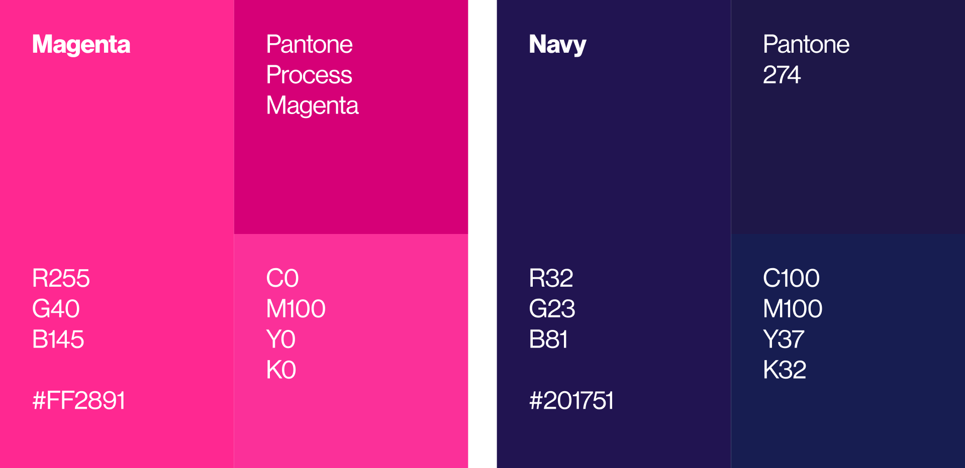
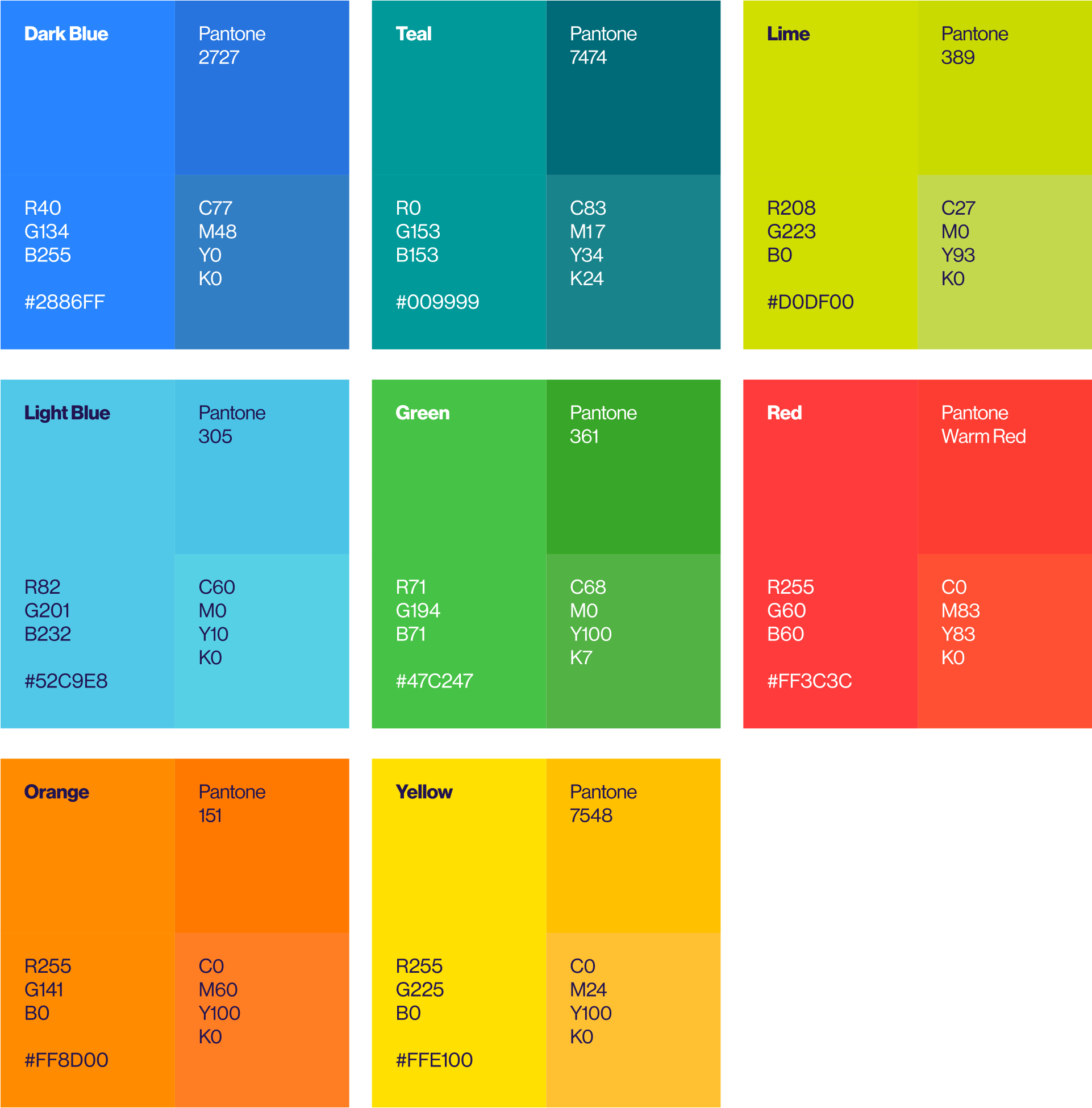
Our colour palette helps us create immediate brand recognition throughout our communications.
Primary colours

Secondary colours

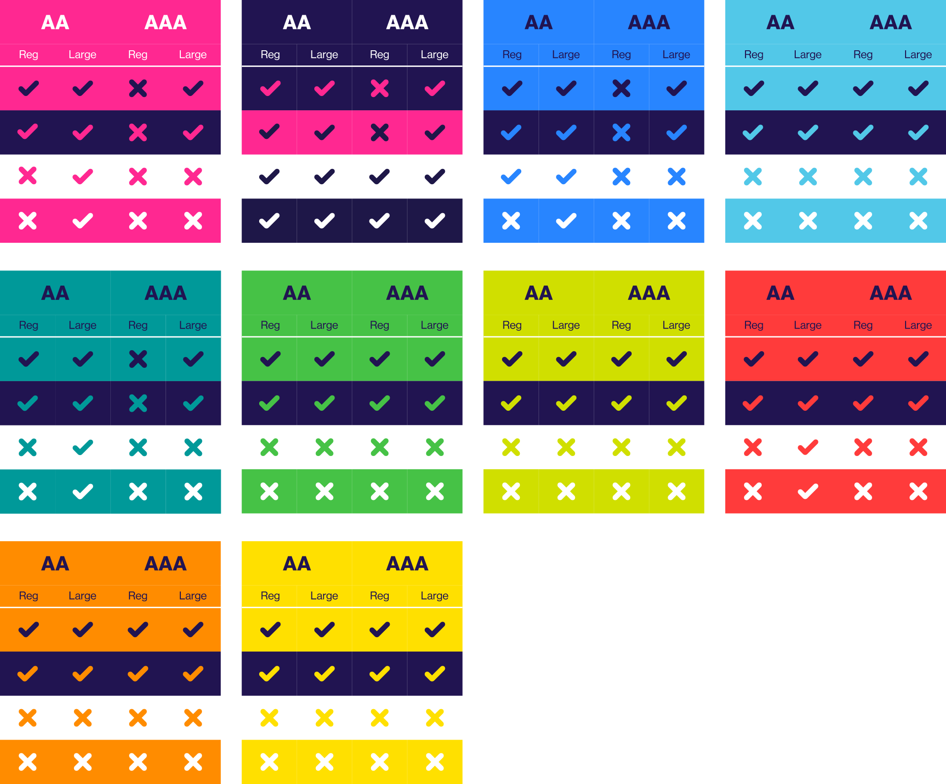
Colour accessibility
Text must have a contrast ratio of at least 4.5:1/7:1 (AA/AAA) for regular sized text (12pt) and at least 3:1 /4.5:1 (AA/AAA) for large scale text 18pt+ or 14pt bold), unless the text is decorative.

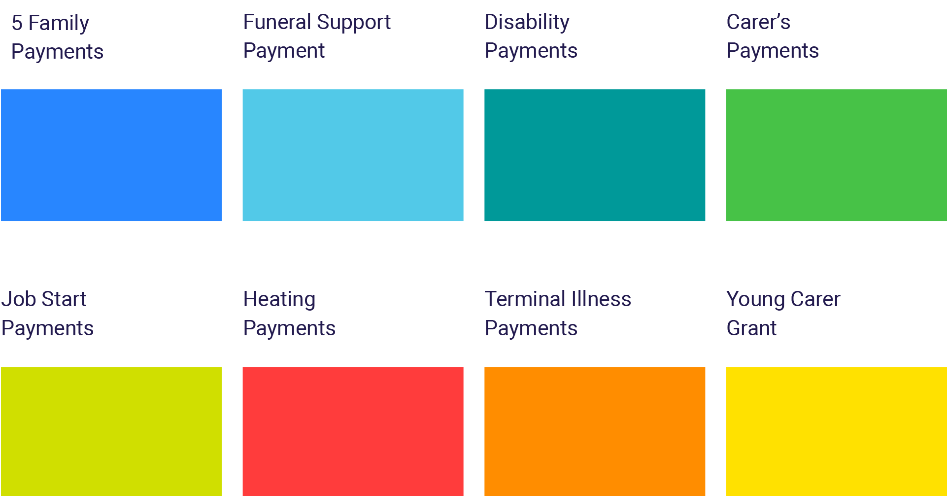
Colour association
Each of the benefits we deliver has a secondary colour assigned to it. These colours are used on materials created for our clients and help to differentiate between benefits.

