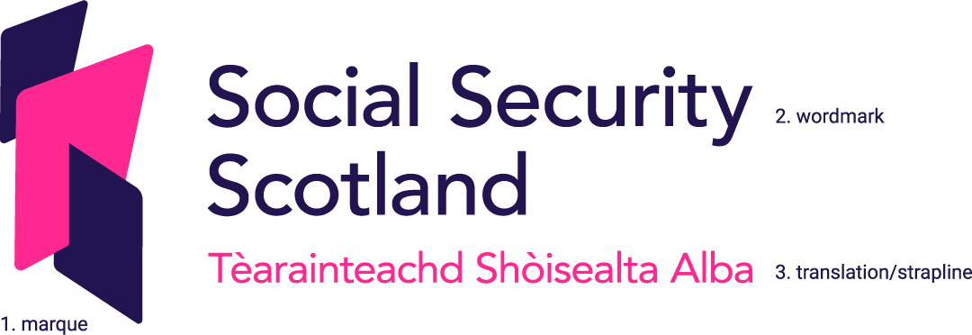
Our logo
Primary logo
Our logo is made up of three separate elements; the marque (1), wordmark (2) and the translation/strapline (3). It’s an instantly recognisable brand element and should be represented consistently across all brand communications.

Logo variations
There will be circumstances where the primary logo isn’t the most appropriate one – whether it’s for small sizes, particular audiences, or special media.
The secondary logo is to be used in situations where the strapline cannot be used in supporting copy or design.
A small use logo has been created for items with very limited space. For example, in social posts. The wordmark is moved so that it sits central within the height of the marque.

Logo colourways
A reversed version of the logo has been created to allow the brand to sit on coloured or textured backgrounds. Legibility should be the prime consideration when choosing which logo to use, ensuring there is a high level of contrast between elements. Please see Our layouts section for examples of use. Always ensure the logo is positioned on backgrounds that provide enough contrast for maximum stand out.

Partner logos
Our logo can appear alongside partner logos. Either logo can appear first. A divider line should be applied between them as shown.


Strapline
Our values are often used as our strapline. Our values are important to us. So please treat it with the same respect you would when applying the logo.


Contact the communications team if you need a logo in a specific format.
