Our typography
Primary typeface
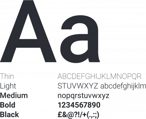
The primary typeface is Roboto. Knowing that 60% of people accessing our services have a disability, it is critical that everything is clear and accessible. Roboto is a sans serif typeface that’s welcoming, but professional and clear.
Roboto is a free font and is available at Google fonts
Secondary typeface
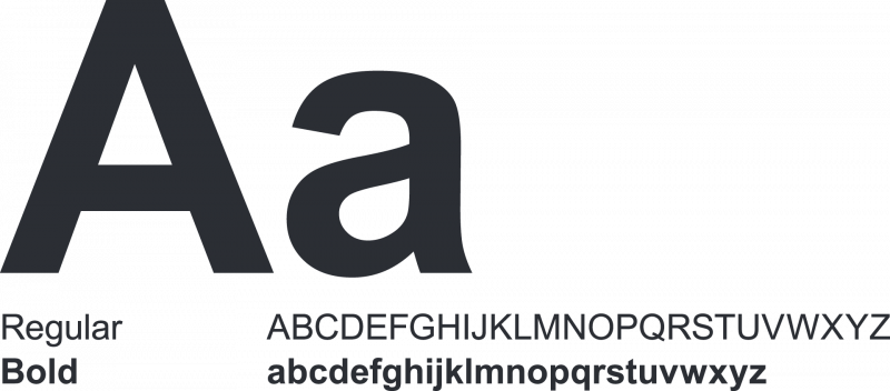
The secondary typeface is Arial. This is used when Roboto is unavailable. For example, on letters and email correspondence.
Accessible design for printed materials
All our content follows the Social Security Scotland style guide.
This advice is for print and corporate documents only. Use the style guide for advice on digital content. Colleagues can find corporate document templates on Saltire under brand resources.
Make fonts clear and easy to read
- use Arial
- use a minimum type size of 12 point for body text
- use regular font weight for body text
- use a larger font size for headings
- do not use block capitals for sentences or headings
- do not use bold, block capitals, italics or underlining for emphasis in body text
- do not mix font styles in the same document
Use consistent paragraph styles
- justify text on the left
- keep line length short - between 60 and 70 characters per line
- do not hyphenate words across lines
- use at least 1.5 line spacing
- keep headings with paragraphs
Keep layout clear and uncluttered
- keep headings and page numbers consistent
- do not print text over images or busy backgrounds
- do not wrap text around images
- include a contents page for longer documents
- only use approved corporate images and photos - contact the creative communications team for more advice